Your logo is your identity. It represents who you are, what you stand for, your values and your ethos. It grabs attention and makes a strong first impression. A good logo will become synonymous with your brand, it will be immediately recognisable and memorable, and will appear on all your promotional materials and stationery. But how do we represent all of this in a simple graphic? If you’re thinking about redesigning your logo, read these five important tips first.
Keep it Simple
A logo must be striking and easy to remember. Some of the most memorable logos consist of a single typeface or a simple icon. Don’t go overboard with complex design elements.
“Simplicity is the ultimate sophistication.” – Leonardo da Vinci
Logos that are too fussy, incorporate too many colours or typefaces are likely to cause confusion. They may be memorable but for all the wrong reasons.
Make it Versatile
Your logo is likely to be used across a variety of platforms. This will include your website (and remember that this will not only be viewed on your desktop computer but on smart phones, tablets and other devices), on printed materials such as business cards and brochures, on promotional products, on email newsletters and across a number of different social media channels. It will be required in a number of different formats and in different sizes. Versatility and scalability is key.
Make it Last
It’s unlikely that you will be going through this process again for some time. Avoid fads and current design trends that will become dated. Opt for a design that will last.
Consider Colour
Unless you have company colours that you must adhere to, think carefully about your colour choices. Consider what colours represent to different audiences and in different parts of the world. Think about the feelings they induce. Take a look at this infographic.
Typography
How many brands can you think of that can be identified by their logo typography? This is another important element of logo design and should warrant careful consideration. This links to your identify, to your ‘message’ and to how you are recognised and remembered. A business selling vintage costume jewellery may opt for a vintage style typeface. Whereas a business creating state of the art machinery may opt for a more contemporary or ‘cutting edge’ typeface.
The planning stage of redesigning a logo will ensure you are clear on your identity, your message and how you want to be portrayed. It is worth allocating time and resource to this area. The following websites provide further reading and inspiration:
- www.logomoose.com
- www.logopond.com
- www.logoed.co.uk
- www.logogala.com
- www.designspiration.com
- www.thedesigninspiration.com
- www.pinterest.com
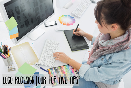
[Image Source: www.shutterstock.com]


